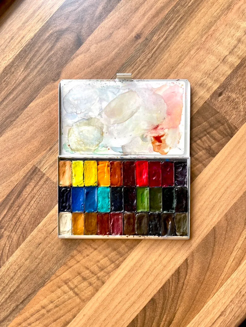
Watercolour was my first love when I first really explored painting at school. It’s totally non-intimidating, it’s a fast medium to work in, it’s easy to set up and readily available.
I had various ready made basic Cotman palettes by the ever present Winsor & Newton brand here in the UK and pushed them as far as I could for many years, in fact I hadn’t painted with artist grade watercolour until around 2017. This was when I’d been beguiled by the loose and free work of Liz Steel and I wanted to see for myself what the handling was like.
After I bought a few single tubes of Daniel Smith paints on the suggestion of a Liz Steel course I did to help me get back into watercolour, I was hooked. There is a whole world of difference between the chalky sad Cotman pans that take a whole lot of brush scrubbing to get a meaningful amount of pigment to paint with, and the luscious, rich and vibrant artist quality paints with far less filler and binder.
I buy the largest tubes I can once I am sure I love working with a colour and squeeze them into pans to dry. I use it from the tube when doing large pieces only and I need a decent quantity of paint mixed up into a wash but otherwise I prefer using it from the pan, dry.
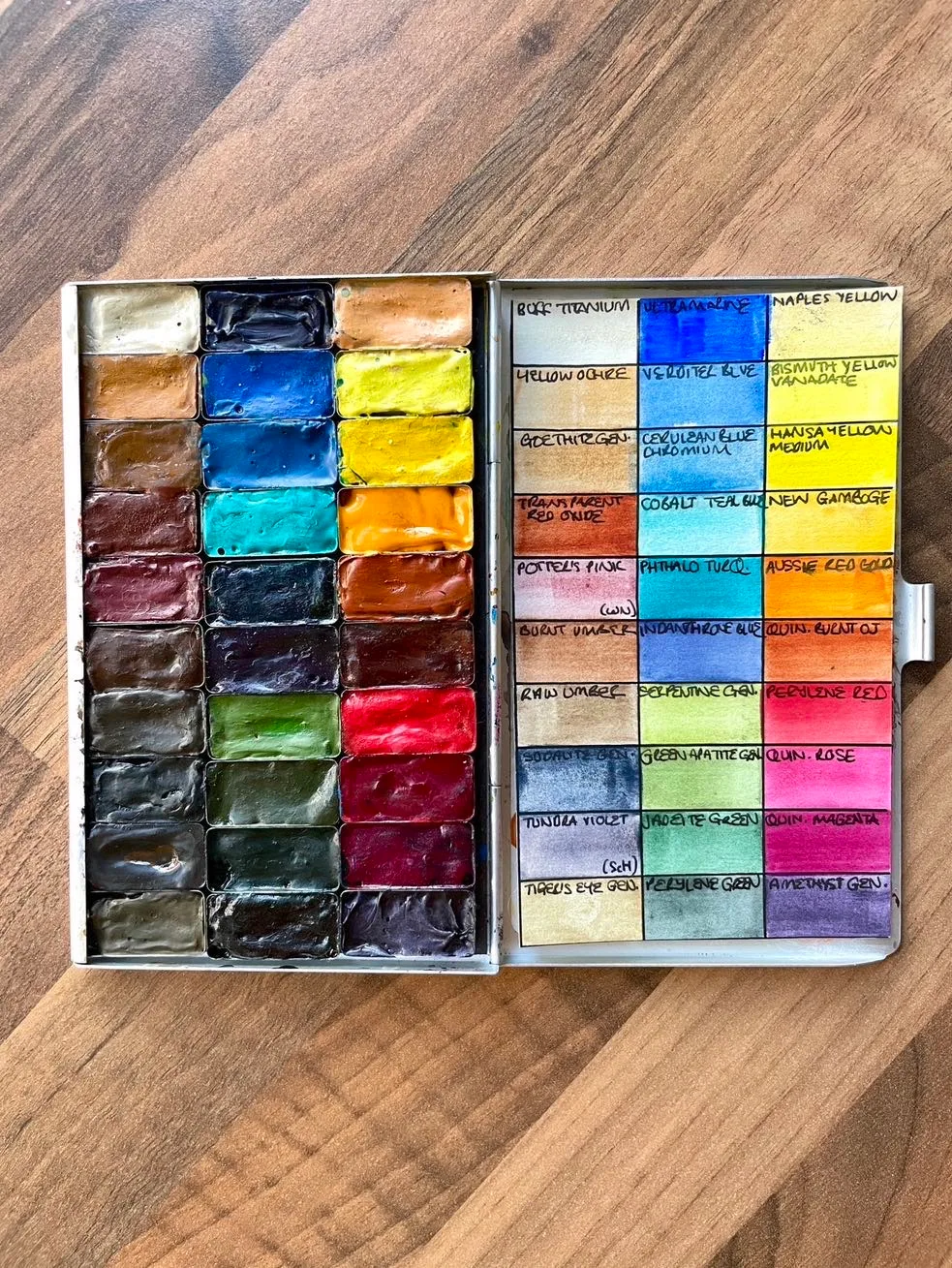
As you can see, my selection has grown somewhat and these are the paints I consistently reach for. They are mainly Daniel Smith but some paints I discovered through experimentation that I prefer by different makers. Here’s a full list of my ‘everyday’ paints for the curious amongst us:
Top Row
Middle Row
Bottom Row
As for the palette itself, I use this what is called “Folio” palette by ArtToolKit. You can customise the pans to be bigger or smaller but I just wanted 30 of their “standard” pans which are 13x26mm in size. They are big enough to use my large size 12 round or 1/2 inch dagger brush in them comfortably.
It’s very lightweight but surprisingly sturdy so perfect to take on your travels. Admittedly my travels are to coffee shops, not the Arctic like the owner and creator of ArtToolKit does! The case has a large and very strong magnet to keep the pans in place and works well so long as you don’t drop the palette from a height (that was fun, getting them back in order and getting the carpet fuzz off them!).
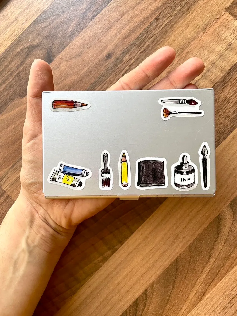
I have never grown up so take any opportunity to decorate anything I can with stickers, and these are from a set by Samantha Dion Baker.
The mixing space is (from what I can tell) a vinyl sticker and it offers a decent amount of room to blend your own colours but when I’m in the studio, I often use a large porcelain palette to do so. I highly recommend these palettes and in fact it is my second one.
This palette is much smaller and holds about half the number of paints. This was a premade set curated by Samantha Dion Baker, using my favourite independent maker Greenleaf Blueberry. It is no longer available to buy as the number released were limited but you can buy all the colours from Greenleaf Blueberry direct and support a small, independent maker.
Once I have used up the colours in this palette, I plan to only keep the Greenleaf colours which I love the most and those would be the faux gold, faux silver, the cassel earth and the black. I will more than likely add some large mixing pans that you can buy from ArtToolKit individually so I can have more space to mix when out and about on my (coffee shop) expeditions!
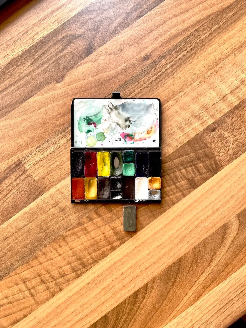
The only issue for me is because I live in England, I feel it’s wrong to be buying one or two pans of paint at a time and having them flown/shipped to me from America for environmental reasons. I adore their slate grey colour which is uncommonly spoken of, I think, because it is of a reasonably low tinting strength and also that it’s value range is very tight. Meaning it is a weak pigment and you can’t darken it significantly, even by painting multiple layers of it.
But I have discovered a maker here who produces a very similar shade of slate which is the single pan you see out of the palette in the photo above. This maker is AJ Ludlow and it comes in gorgeous glass jars to paint from directly or transfer, as I have, with a palette knife to a pan to dry. I use this colour to compose a piece in direct watercolour first, and less commonly when I want a pale grey. This and DS Tiger’s Eye Genuine are fabulous to use for underpaintings in this manner primarily because of their low tinting strength and limited value range. They give enough contrast to get large shapes down, indicate the darkest values but to also fade away when further more pigmented paint is added on top.
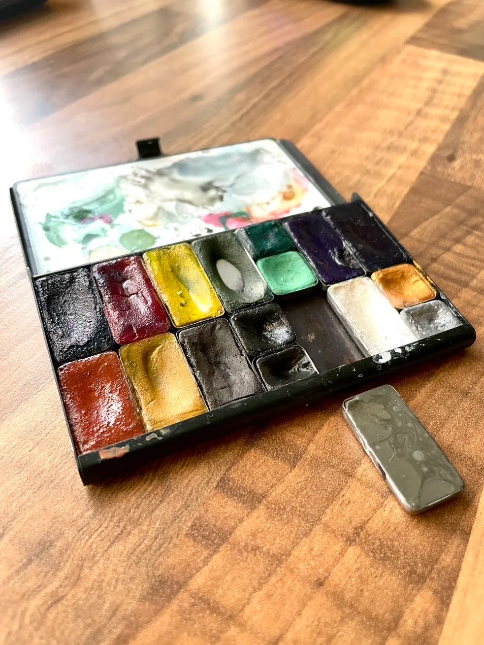
All of these paint choices came about by experimentation. I started with small sets or single tubes of primary colours and gradually added and removed colours until these palettes are my go to sets. I have realised I can live without the Bismuth Vanadate Yellow and the Hansa Medium Yellow so I won’t replace those when they are empty but that’s the only change I am looking to make any time soon.
The three Primatek greens in my mine palette are there as a perfect mix for foliage throughout the seasons, and their genuine gem nature gives beautiful granulation when used in broad washes. Which is possibly why I find the cool and warm primary yellows mentioned above unnecessary as I don’t often mix my own greens.
Your choices will be different based upon lots of factors such as whether you like to mix your own hues or prefer ready made paints (often referred to as ‘convenience colours’). I paint a lot of animals, human portraits, food and urban scenes so these choices work for me. I definitely want to share which colours I select depending upon the subject I’m paintings as I have narrowed them down in discrete limited palettes.
Watch this space for more wittering about paint choices in the future.
